설명
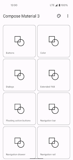
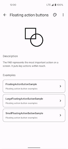
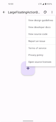
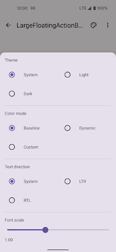
A canonical reference of Material Design components, theming, dark theme, and how to implement these features in Jetpack Compose: the Compose Material Catalog. The catalog consists of three main screens: the home screen, the component screen, and the example screen. At any point you can launch the theme picker or “more” menu from the top app bar. The app also supports dark theme.
더보기
OTHERS:LIBRARIES_AND_DEMO
버전 1.3.5의 새로운 기능
마지막 업데이트: Jan 13,2025
사소한 버그 수정 및 개선 사항이 포함되어 있습니다. 최신 버전을 설치하거나 업데이트하여 확인해 보세요!
숨기기
화면 캡처
정보
-
업데이트 날짜2025-01-13
-
현재 버전2.4.0
-
제공자

-
APK 크기0MB
-
안드로이드 필요Android 4.4+