Compose Material Catalog
Google LLC
-
Aggiornata
2025-01-13
-
Versione corrente
2.4.0
-
Offerta da

Description
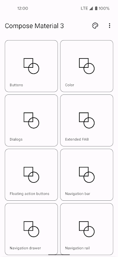
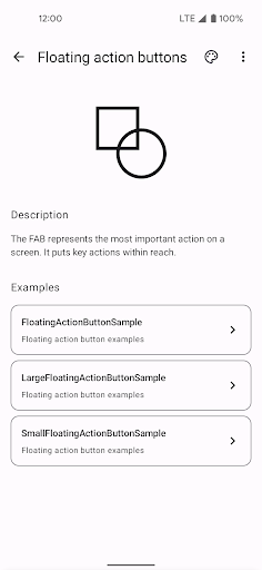
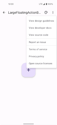
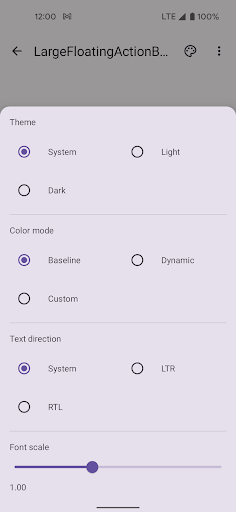
A canonical reference of Material Design components, theming, dark theme, and how to implement these features in Jetpack Compose: the Compose Material Catalog. The catalog consists of three main screens: the home screen, the component screen, and the example screen. At any point you can launch the theme picker or “more” menu from the top app bar. The app also supports dark theme.
Mostra altro
OTHERS:LIBRARIES_AND_DEMO
Novità nella versione 1.3.5
Ultimo aggiornamento il Jan 13,2025
Correzioni di bug minori e miglioramenti. Installa o aggiorna alla versione più recente per provarla!
Mostra meno
Screenshot
Information
-
Aggiornata2025-01-13
-
Versione corrente2.4.0
-
Offerta da

-
Apk size0MB
-
Richiede AndroidAndroid 4.4+