설명
Jetpack Compose offers an implementation of Material Design, a comprehensive design system for creating digital interfaces. The Material Design components (buttons, cards, switches, and so on) are built on top of Material Theming, which is a systematic way to customize Material Design to better reflect your product’s brand. A Material Theme contains color, typography, and shape attributes. When you customize these attributes, your changes are automatically reflected in the components you use to build your app.
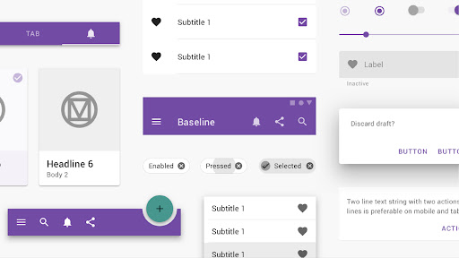
Components
Material Components are interactive building blocks for creating a user interface.
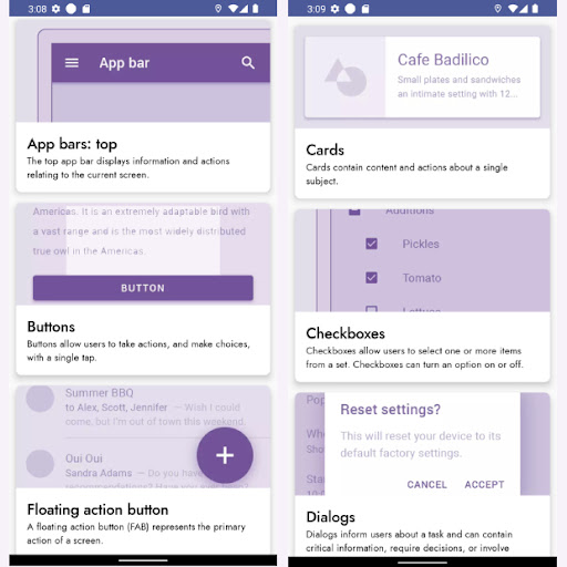
* App bars: bottom
* App bars: top
* Backdrop
* Banners
* Bottom navigation
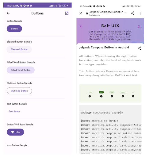
* Buttons
* Buttons: floating action button
* Cards
* Dialogs
* Dividers
* Image lists
* Lists
* Menus
* Navigation drawer
* Navigation rail
* Progress indicators
* Selection controls
* Sheets: bottom
* Sheets: side
* Sliders
* Snack bars
* Tabs
* Text fields
* Swipe to refresh
You will get more updates.
Bolt UIX
Get started with Android (Kotlin, Jet Compose) & IOS (Swift UI), MVVM clean architecture, and UI UX design pattern.
https://www.boltuix.com/
Source code:
Jet Compose
https://www.boltuix.com/search/label/*%20Jetpack%20Compose
Compose ICE CREAM app template
https://www.boltuix.com/2022/01/ice-cream-app-ui-ux.html
Join us
https://www.youtube.com/channel/UCr6xjVwoyVkx7Q5AMEoUzhg?sub_confirmation=1
더보기
OTHERS:LIBRARIES_AND_DEMO
버전 1.3.5의 새로운 기능
마지막 업데이트: Jan 13,2025
사소한 버그 수정 및 개선 사항이 포함되어 있습니다. 최신 버전을 설치하거나 업데이트하여 확인해 보세요!
숨기기
화면 캡처
정보
-
업데이트 날짜2025-01-13
-
현재 버전1.0.22
-
제공자

-
APK 크기0MB
-
안드로이드 필요Android 4.4+